> ## Documentation Index
> Fetch the complete documentation index at: https://docs.useparagon.com/llms.txt
> Use this file to discover all available pages before exploring further.
# Custom Dropdowns
> Provide your users with dropdown options from your application.
## Overview
Custom Dropdowns allow you to include custom dropdown inputs in the Connect Portal as a part of the User Settings of your integration.
You can use Custom Dropdowns to allow your users to select:
* Data from your app, like a destination Project to sync Jira tickets into
* A type of User Setting that Paragon does not support natively, like a custom Salesforce enum.
## Usage
To get started with Custom Dropdowns, visit your User Settings and add a new type of **Custom Dropdown:**
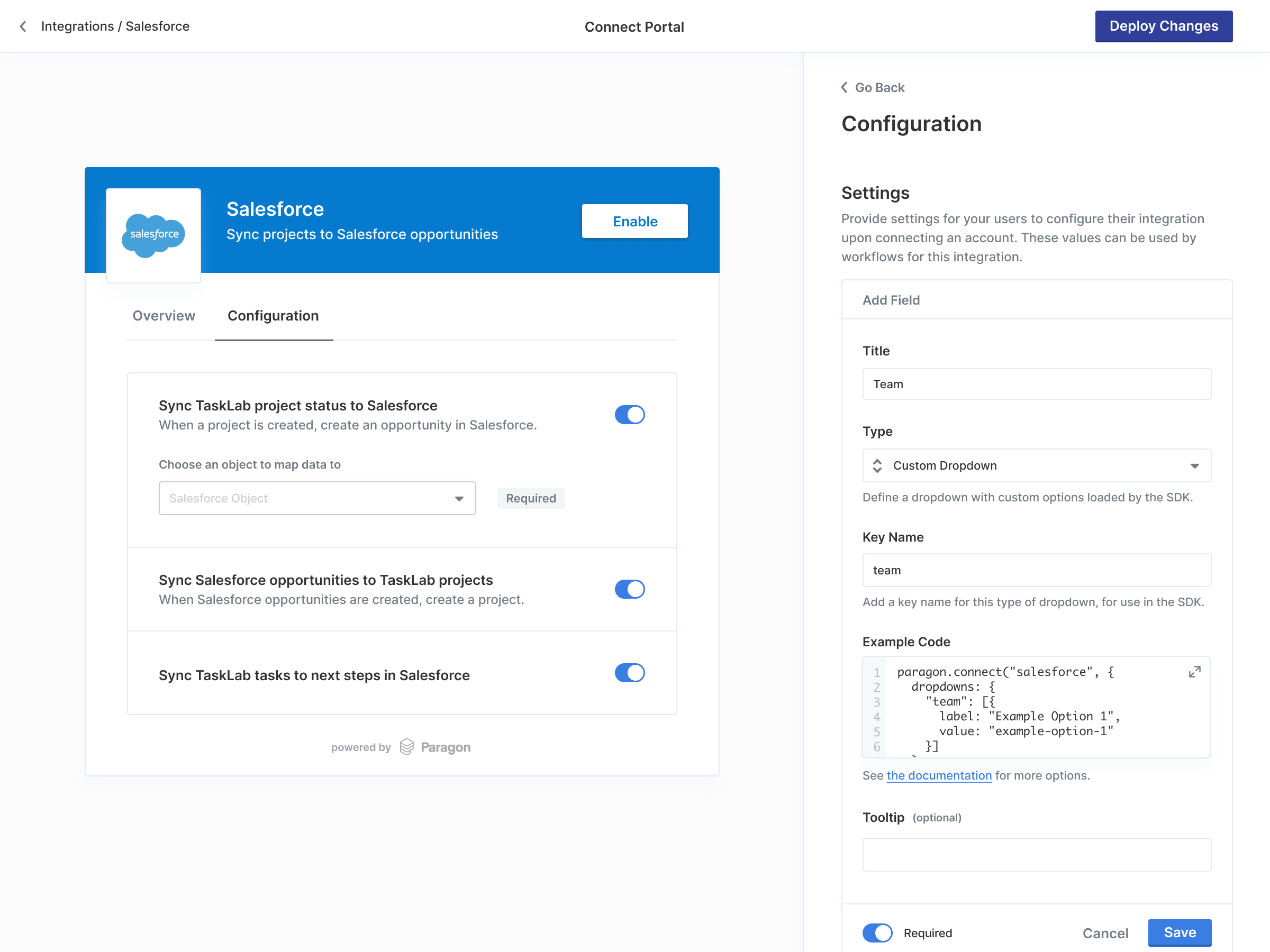 Set a key name to refer to the dropdown when populating its available options.
After setting a key name, an example of the code you need to call from your application to populate the dropdown will appear in the dashboard:
```js theme={null}
paragon.connect("jira", {
dropdowns: {
team: [
{ label: "Team 1", value: "team-1" },
{ label: "Team 2", value: "team-2" },
],
},
});
```
Update your `paragon.connect` call to include the `dropdowns` parameter, which has the key names that you set above. This key can be set to an array of options with two keys:
* `label` — The displayed text shown to the user for the dropdown option.
* `value` — The value that will be saved (e.g. an option ID) when the user selects this dropdown option.
* This value must be unique across all options in the array. If the value is found to be non-unique, the non-unique option will not be displayed in the list, and a console warning will appear.
* If either `label` or `value` are missing, the option will not be displayed, and a console warning will appear.
When reading the selection for this User Setting from the SDK or the Workflow Editor, the value will be set to the `value` property of the chosen option (or undefined if unselected).
## Pagination and search
If your dropdown data is a large data set, consider defining pagination and search instead of passing a static list.
Here is an example of a `loadOptions` function to paginate over a user's Google Drive folders:
```javascript Example: Custom Dropdown loading Google Drive folders expandable theme={null}
paragon.connect("googledrive", {
dropdowns: {
drivefolder: {
loadOptions: async (cursor, search) => {
try {
const encodedQuery = encodeURIComponent(
`mimeType='application/vnd.google-apps.folder'${
search ? ` and name contains '${search}'` : ""
}`
);
const foldersUrl = `https://www.googleapis.com/drive/v3/files?q=${encodedQuery}&fields=nextPageToken,files(id,name)&supportsAllDrives=true&includeItemsFromAllDrives=true&pageSize=50${
cursor ? `&pageToken=${cursor}` : ""
}`;
const foldersResponse = await paragon.request("googledrive", foldersUrl, { method: "GET" });
const folders = foldersResponse.files.map((folder) => ({
label: folder.name,
value: folder.id,
}));
return {
options: folders,
nextPageCursor: foldersResponse.nextPageToken,
};
} catch (err) {
console.error("Error fetching Drive options", err);
}
},
},
},
});
```
When you provide an object that includes the `loadOptions` function instead of a static list, the dropdown will paginate through options as the user scrolls and allow for remote search across all available data.
`loadOptions` will be called with 2 arguments:
* `cursor`: The last cursor to be called by the dropdown. If loading for the first time, this value will be undefined.
* `search`: The search term that the user typed into the dropdown. If no search term was provided, this value will be undefined or the empty string (`""`).
### Customizing dropdown refresh
By default, dropdown options are loaded once when the Connect Portal is opened or when the `search` term changes.
If your options change frequently and you want them to reload each time the user opens the dropdown, you can set the `refreshOnOpen` option to `true`:
```javascript theme={null}
paragon.connect("googledrive", {
dropdowns: {
drivefolder: {
refreshOnOpen: true,
loadOptions: async (cursor, search) => {
// Options will be reloaded each time the dropdown opens
// ...
},
},
},
});
```
When `refreshOnOpen` is set to `true`, the `loadOptions` function will be called again each time the user opens the dropdown, ensuring they always see the most up-to-date options.
Set a key name to refer to the dropdown when populating its available options.
After setting a key name, an example of the code you need to call from your application to populate the dropdown will appear in the dashboard:
```js theme={null}
paragon.connect("jira", {
dropdowns: {
team: [
{ label: "Team 1", value: "team-1" },
{ label: "Team 2", value: "team-2" },
],
},
});
```
Update your `paragon.connect` call to include the `dropdowns` parameter, which has the key names that you set above. This key can be set to an array of options with two keys:
* `label` — The displayed text shown to the user for the dropdown option.
* `value` — The value that will be saved (e.g. an option ID) when the user selects this dropdown option.
* This value must be unique across all options in the array. If the value is found to be non-unique, the non-unique option will not be displayed in the list, and a console warning will appear.
* If either `label` or `value` are missing, the option will not be displayed, and a console warning will appear.
When reading the selection for this User Setting from the SDK or the Workflow Editor, the value will be set to the `value` property of the chosen option (or undefined if unselected).
## Pagination and search
If your dropdown data is a large data set, consider defining pagination and search instead of passing a static list.
Here is an example of a `loadOptions` function to paginate over a user's Google Drive folders:
```javascript Example: Custom Dropdown loading Google Drive folders expandable theme={null}
paragon.connect("googledrive", {
dropdowns: {
drivefolder: {
loadOptions: async (cursor, search) => {
try {
const encodedQuery = encodeURIComponent(
`mimeType='application/vnd.google-apps.folder'${
search ? ` and name contains '${search}'` : ""
}`
);
const foldersUrl = `https://www.googleapis.com/drive/v3/files?q=${encodedQuery}&fields=nextPageToken,files(id,name)&supportsAllDrives=true&includeItemsFromAllDrives=true&pageSize=50${
cursor ? `&pageToken=${cursor}` : ""
}`;
const foldersResponse = await paragon.request("googledrive", foldersUrl, { method: "GET" });
const folders = foldersResponse.files.map((folder) => ({
label: folder.name,
value: folder.id,
}));
return {
options: folders,
nextPageCursor: foldersResponse.nextPageToken,
};
} catch (err) {
console.error("Error fetching Drive options", err);
}
},
},
},
});
```
When you provide an object that includes the `loadOptions` function instead of a static list, the dropdown will paginate through options as the user scrolls and allow for remote search across all available data.
`loadOptions` will be called with 2 arguments:
* `cursor`: The last cursor to be called by the dropdown. If loading for the first time, this value will be undefined.
* `search`: The search term that the user typed into the dropdown. If no search term was provided, this value will be undefined or the empty string (`""`).
### Customizing dropdown refresh
By default, dropdown options are loaded once when the Connect Portal is opened or when the `search` term changes.
If your options change frequently and you want them to reload each time the user opens the dropdown, you can set the `refreshOnOpen` option to `true`:
```javascript theme={null}
paragon.connect("googledrive", {
dropdowns: {
drivefolder: {
refreshOnOpen: true,
loadOptions: async (cursor, search) => {
// Options will be reloaded each time the dropdown opens
// ...
},
},
},
});
```
When `refreshOnOpen` is set to `true`, the `loadOptions` function will be called again each time the user opens the dropdown, ensuring they always see the most up-to-date options.