> ## Documentation Index
> Fetch the complete documentation index at: https://docs.useparagon.com/llms.txt
> Use this file to discover all available pages before exploring further.

# Input Type Reference

> Input types to render in the Connect Portal for User Settings.

## Overview

This is a reference of all of the input types that are used in the Connect Portal for collecting user input for pre-OAuth options, post-OAuth options, or User Settings.

Implement handlers for each input type to ensure that your UI can prompt your users with the right input types when needed by the integration.

<Tip>
  If your app uses React, we recommend starting with our [reference implementation](https://github.com/useparagon/connect-headless-example/blob/main/src/components/feature/serialized-connect-input-picker.tsx), which handles each of the input types below. You can adapt this code for your app or use it as a reference point as you implement.
</Tip>

Some inputs will require loading integration data dynamically using the SDK (for example, loading a list of channels from Slack). See [Exposing User Settings](/connect-portal/headless-connect-portal#exposing-user-settings) for more guidance on loading dynamic data.

## Input Types

<table style={{ width: '100%', borderCollapse: 'collapse' }} id="top-aligned-table">
  <thead>
    <tr>
      <th style={{ textAlign: 'left', verticalAlign: 'top', padding: '8px', borderBottom: '2px solid #ddd' }}>Input Type</th>
      <th style={{ textAlign: 'left', verticalAlign: 'top', padding: '8px', borderBottom: '2px solid #ddd' }}>SidebarInputType Key(s)</th>
      <th style={{ textAlign: 'left', verticalAlign: 'top', padding: '8px', borderBottom: '2px solid #ddd' }}>Example (click to expand)</th>
      <th style={{ textAlign: 'left', verticalAlign: 'top', padding: '8px', borderBottom: '2px solid #ddd' }}>Used In</th>
      <th style={{ textAlign: 'left', verticalAlign: 'top', padding: '8px', borderBottom: '2px solid #ddd' }}>Value Type</th>
    </tr>
  </thead>

  <tbody>
    <tr>
      <td>**Text input**<br />Set the <code>type</code> attribute of the text input based on the input type.</td>
      <td><code>ValueText</code> | <code>Number</code> | <code>Email</code> | <code>URL</code> | <code>Password</code></td>

      <td>
        <img src="https://mintcdn.com/paragon/csc0twkSS9cXclQU/assets/text-input-example.png?fit=max&auto=format&n=csc0twkSS9cXclQU&q=85&s=926b2ca41aa08258a6d5644ff2b2a678" width="1326" height="156" data-path="assets/text-input-example.png" />
      </td>

      <td>
        <ul>
          <li>PreOptionsStage</li>
          <li>PostOptionsStage</li>
          <li>User Settings</li>
        </ul>
      </td>

      <td>`string`</td>
    </tr>

    <tr>
      <td>**Textarea input**<br />Note that by default, lines = 1 (in this case, this input should look identical to a text input).</td>
      <td><code>ValueTextArea</code></td>

      <td>
        <img src="https://mintcdn.com/paragon/csc0twkSS9cXclQU/assets/textarea-input-example-focused.png?fit=max&auto=format&n=csc0twkSS9cXclQU&q=85&s=b54c198104e15d60e24def423cb5268f" width="1522" height="232" data-path="assets/textarea-input-example-focused.png" />
      </td>

      <td>
        <ul>
          <li>PreOptionsStage</li>
          <li>PostOptionsStage</li>
          <li>User Settings</li>
        </ul>
      </td>

      <td>`string`</td>
    </tr>

    <tr>
      <td>**Switch / toggle input**</td>
      <td><code>BooleanInput</code> | <code>Switch</code></td>

      <td>
        <img style={{ width: "150px"}} src="https://mintcdn.com/paragon/csc0twkSS9cXclQU/assets/switch-example.png?fit=max&auto=format&n=csc0twkSS9cXclQU&q=85&s=bed951dce3f085dd05b0e5e15452cbef" width="430" height="116" data-path="assets/switch-example.png" />
      </td>

      <td>
        <ul>
          <li>PreOptionsStage</li>
          <li>PostOptionsStage</li>
          <li>User Settings</li>
        </ul>
      </td>

      <td>`boolean`</td>
    </tr>

    <tr>
      <td><strong>Dropdown input</strong></td>
      <td><code>Enum</code> | <code>DynamicEnum</code> | <code>CustomDropdown</code></td>

      <td>
        <img src="https://mintcdn.com/paragon/p_CuCy_equ6Xxvlm/assets/enum-input.png?fit=max&auto=format&n=p_CuCy_equ6Xxvlm&q=85&s=84600fc563da8aee979425e09d36dbaf" width="1156" height="220" data-path="assets/enum-input.png" />
      </td>

      <td>
        <ul>
          <li>PreOptionsStage (`Enum` only)</li>
          <li>PostOptionsStage (`Enum` and `DynamicEnum` only)</li>
          <li>User Settings</li>
        </ul>
      </td>

      <td>`string`</td>
    </tr>

    <tr>
      <td>
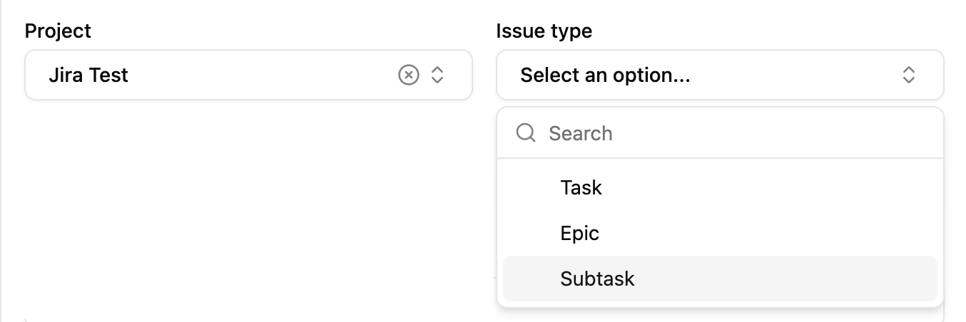
        <strong>Combo dropdown input</strong><br />
        Dual dropdown input where items for the secondary dropdown are populated based on the input of the primary dropdown.
      </td>

      <td><code>ComboInput</code></td>

      <td>
        <img src="https://mintcdn.com/paragon/esBRs8T9ngw7PCPW/assets/combo-input-example.png?fit=max&auto=format&n=esBRs8T9ngw7PCPW&q=85&s=f728c97ae9c428c6b8dd14b1d3d682f3" width="1354" height="452" data-path="assets/combo-input-example.png" />
      </td>

      <td>
        <ul>
          <li>PostOptionsStage</li>
          <li>User Settings</li>
        </ul>
      </td>

      <td>[`ComboDropdownValue`](#combodropdownvalue)</td>
    </tr>

    <tr>
      <td>
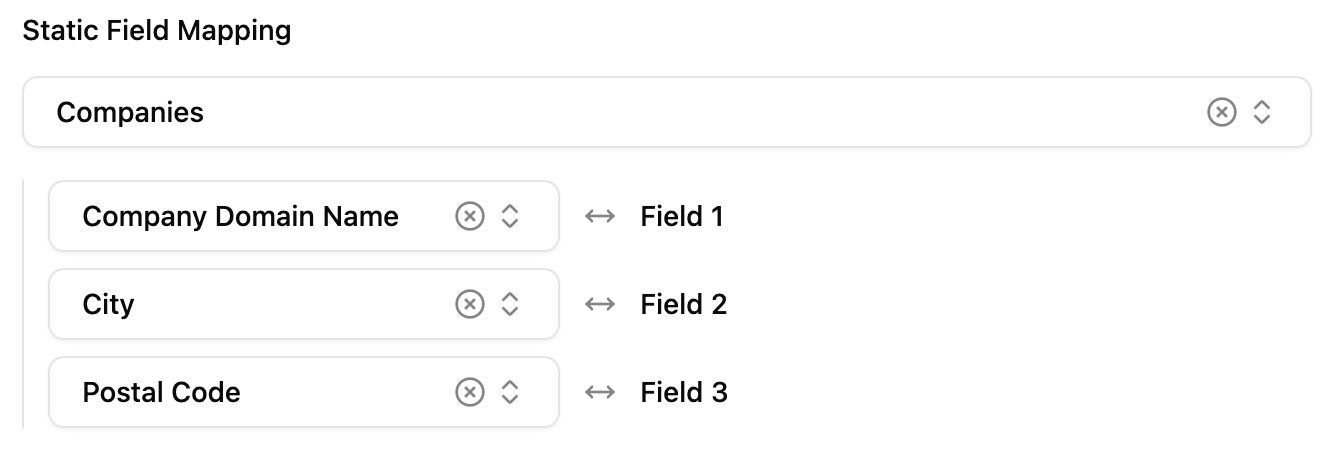
        <strong>Field mapping input</strong><br />
        Input to map fields between an Object Type in the connected integration and an Object Type in your application.
      </td>

      <td><code>FieldMapper</code></td>

      <td>
        <img src="https://mintcdn.com/paragon/l1vzjNTWrUIk0ls8/assets/field-mapping-example.png?fit=max&auto=format&n=l1vzjNTWrUIk0ls8&q=85&s=7e8c9fd387a8438f2fb4795cf6d12cbe" width="1342" height="462" data-path="assets/field-mapping-example.png" />
      </td>

      <td>
        <ul>
          <li>User Settings</li>
        </ul>
      </td>

      <td>[`FieldMappingValue`](#fieldmappingvalue)</td>
    </tr>

    <tr>
      <td>
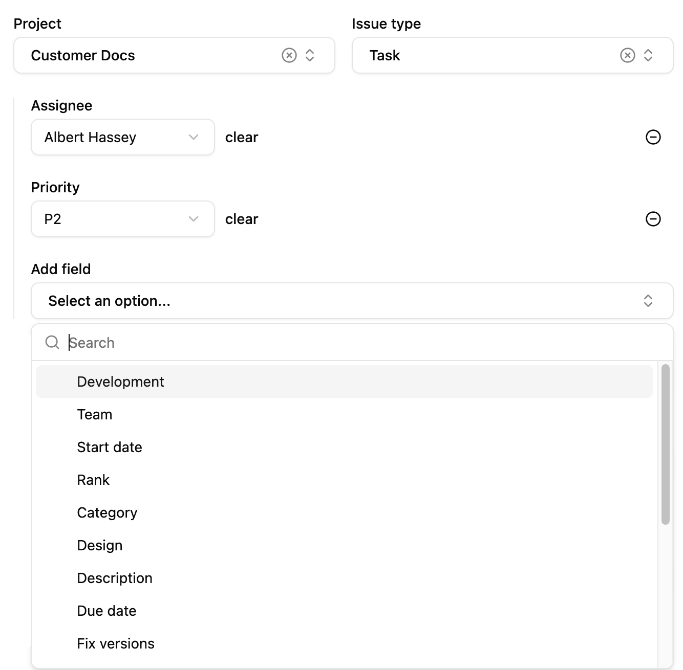
        <strong>Default value mapping input</strong><br />
        Input to map "default values" for each field of a particular object when it is created by your integration. <br /><br /><strong>Note:</strong> This is currently only supported for the Jira: Issue Field Values input.
      </td>

      <td><code>DynamicComboInput</code></td>

      <td>
        <img src="https://mintcdn.com/paragon/esBRs8T9ngw7PCPW/assets/default-value-mapping-example.png?fit=max&auto=format&n=esBRs8T9ngw7PCPW&q=85&s=dad47367de077ebade0bc4bf7ac7b121" width="1334" height="1310" data-path="assets/default-value-mapping-example.png" />
      </td>

      <td>
        <ul>
          <li>User Settings</li>
        </ul>
      </td>

      <td>[`DefaultValueMapping`](#defaultvaluemappingvalue)</td>
    </tr>

    {/* <tr>
            <td>**Readonly text copy input**<br/>Input to display a value to the user that they can copy to use elsewhere, like a redirect URL.</td>
            <td><code>CopyableInput</code></td>
            <td><img src="/assets/conditional-input.png" /></td>
            <td>
              <ul>
                <li>PostOptionsStage (only for `user-configured-oauth` Authentication Type)</li>
              </ul>
            </td>
          </tr>
          <tr>
            <td>**Scope selection input**<br/>Input to display a list of scopes to the user that they can select from.</td>
            <td><code>Permission</code></td>
            <td><img src="/assets/permission-input.png" /></td>
            <td>
              <ul>
                <li>PostOptionsStage (only for `user-configured-oauth` Authentication Type)</li>
              </ul>
            </td>
          </tr> */}
  </tbody>
</table>

## Compound Value Types

Most input types are saved with [`updateIntegrationUserSettings`](/apis/api-reference#updateintegrationusersettings) or [`updateWorkflowUserSettings`](/apis/api-reference#updateworkflowusersettings) as `string` or `boolean` values, but more complex inputs have an object value that must be used to save the state of the input.

Below is a reference for those compound value types.

### ComboDropdownValue

<Frame>
  <img src="https://mintcdn.com/paragon/esBRs8T9ngw7PCPW/assets/combo-input-example.png?fit=max&auto=format&n=esBRs8T9ngw7PCPW&q=85&s=f728c97ae9c428c6b8dd14b1d3d682f3" style={{ width: '400px'}} width="1354" height="452" data-path="assets/combo-input-example.png" />
</Frame>

A combo dropdown input exposes a dual dropdown: the first input is the `mainInput`, and the second input is the `dependentInput`. Both values are saved as strings.

```json Example theme={null}
{
  "mainInput": "JIRATEST",
  "dependentInput": "10005"
}
```

<ParamField path="mainInput" type="string" required>
  The first input in the combo dropdown, for example: the Project input in a Project / Issue Type combo dropdown.
</ParamField>

<ParamField path="dependentInput" type="string" required>
  The second input in the combo dropdown, for example: the Issue Type input in a Project / Issue Type combo dropdown.
</ParamField>

### FieldMappingValue

<Frame>
  <img src="https://mintcdn.com/paragon/l1vzjNTWrUIk0ls8/assets/field-mapping-example.png?fit=max&auto=format&n=l1vzjNTWrUIk0ls8&q=85&s=7e8c9fd387a8438f2fb4795cf6d12cbe" style={{ width: '400px'}} width="1342" height="462" data-path="assets/field-mapping-example.png" />
</Frame>

A field mapping input is a compound input which has an Object Type selection (which can be a combo dropdown input) and a list of fields mapped by a user between an Integration Object and an Application Object.

```json Example theme={null}
{
  "objectType": "JIRATEST",
  "dependentInput": "10005",
  "mappingType": "STATIC",
  "fieldMappings": {
    "[Application Field Key]": "[Integration Field Key]"
  }
}
```

<ParamField path="objectType" type="string" required>
  The Integration Object Type that the user selects.
</ParamField>

<ParamField path="dependentInput" type="string">
  If the Object Type selection is a combo dropdown input (you can determine this by checking for `dependentInputSource` on the Field Mapping input options returned by [`getDataSourceOptions`](/apis/api-reference#getdatasourceoptions)), this will be the value of the dependent input selected by the user. Otherwise, this key can be omitted.
</ParamField>

<ParamField path="mappingType" type="const" required>
  Set to `"STATIC"`.
</ParamField>

<ParamField path="fieldMappings" type="object" required>
  An object where the keys are field keys from the Application Object and the values are field keys from the Integration Object. A key/value pair represents a mapping between a field in the Application Object and a field in the Integration Object.
</ParamField>

### DefaultValueMappingValue

<Frame>
  <img src="https://mintcdn.com/paragon/esBRs8T9ngw7PCPW/assets/default-value-mapping-example.png?fit=max&auto=format&n=esBRs8T9ngw7PCPW&q=85&s=dad47367de077ebade0bc4bf7ac7b121" style={{ width: '400px'}} width="1334" height="1310" data-path="assets/default-value-mapping-example.png" />
</Frame>

A default value mapping input is a compound input which has an Object Type selection (which can be a combo dropdown input) and a list of default values for specific fields of the object.

```json Example theme={null}
{
  "mainInput": "JIRATEST",
  "dependentInput": "10005",
  "variableInput": {
    "[Integration Field Key]": "[Default Value]"
  }
}
```

<ParamField path="mainInput" type="string" required>
  The Integration Object Type that the user selects to map default values for.
</ParamField>

<ParamField path="dependentInput" type="string">
  If the Object Type selection is a combo dropdown input (you can determine this by checking for `dependentInputSource` on the Default Value Mapping input options returned by [`getDataSourceOptions`](/apis/api-reference#getdatasourceoptions)), this will be the value of the dependent input selected by the user. Otherwise, this key can be omitted.
</ParamField>

<ParamField path="variableInput" type="object" required>
  An object where the keys are field keys from the Integration Object and the values are default values for those fields, as provided by the user.
</ParamField>