> ## Documentation Index
> Fetch the complete documentation index at: https://docs.useparagon.com/llms.txt
> Use this file to discover all available pages before exploring further.
# Customizing the Connect Portal
> Control your end-user integration experience by customizing Connect Portal.
The **Connect Portal** is a ready-made interface that lets your users connect their third-party app accounts to your application.
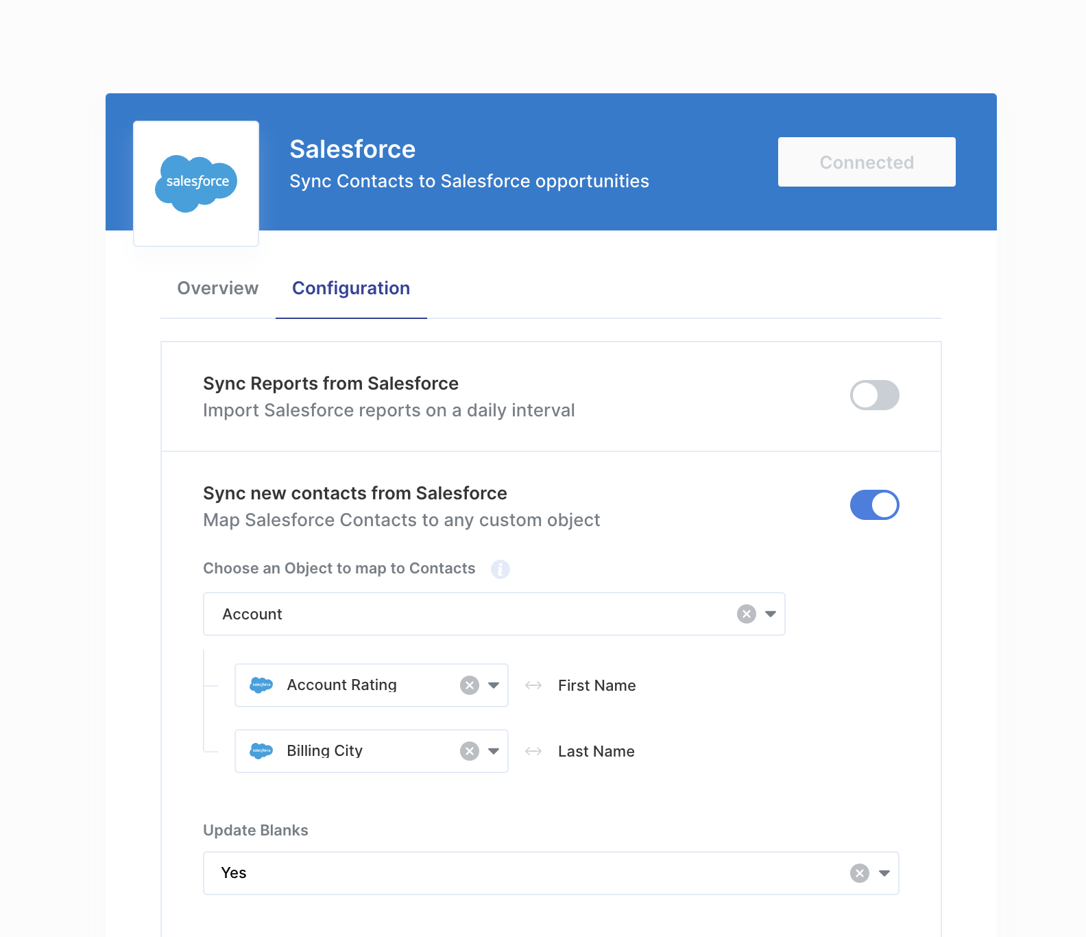 To customize the Connect Portal for a specific integration, go to the Integration Overview page and click **Customize Connect Portal**. This opens the **Connect Portal Editor**.
Within the Connect Portal Editor, you can tailor several aspects of the user experience:
* **[Overview](#overview):** Update the integration's description shown in the Overview tab.
* **[Configuration](#configuration):** Adjust how workflows and workflow settings appear in the Configuration tab.
* **[Appearance](#appearance):** Change the visual style of the Connect Portal.
## Overview
There are two options you can edit in the **Overview** tab:
* **Short description:** a one-line description of your integration that appears at the top of the Connect Portal.
* **Overview**: a long-form description of your integration. This description is the first thing your users see when opening the Connect Portal, so this is the best place to describe and showcase your integration's benefits in detail to your users.
You can use [Markdown formatting](https://commonmark.org/help/) in the Overview section.
To customize the Connect Portal for a specific integration, go to the Integration Overview page and click **Customize Connect Portal**. This opens the **Connect Portal Editor**.
Within the Connect Portal Editor, you can tailor several aspects of the user experience:
* **[Overview](#overview):** Update the integration's description shown in the Overview tab.
* **[Configuration](#configuration):** Adjust how workflows and workflow settings appear in the Configuration tab.
* **[Appearance](#appearance):** Change the visual style of the Connect Portal.
## Overview
There are two options you can edit in the **Overview** tab:
* **Short description:** a one-line description of your integration that appears at the top of the Connect Portal.
* **Overview**: a long-form description of your integration. This description is the first thing your users see when opening the Connect Portal, so this is the best place to describe and showcase your integration's benefits in detail to your users.
You can use [Markdown formatting](https://commonmark.org/help/) in the Overview section.
.png?fit=max&auto=format&n=HSp5hB8tE4Z6e44m&q=85&s=d5cb0b4f3c4306c7fb7f92359945ca55) ## Configuration
### Settings
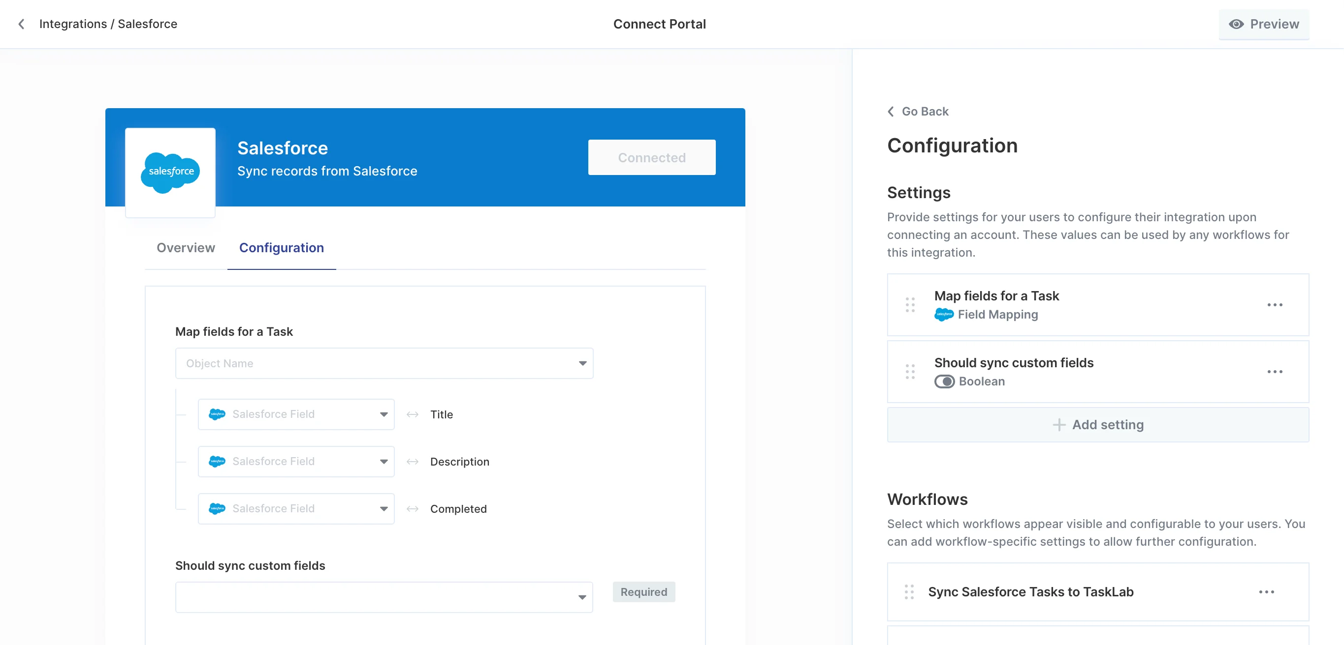
Under the **Settings** section of the Configuration tab, you'll be able to create user-facing settings that allow your users to configure parameters of their workflows from the Connect Portal.
Some example use cases of User Settings include:
* **Slack:** choosing which channel that messages should be sent in
* **Salesforce:** choosing a custom opportunity stage that new opportunities created in
* **Hubspot:** choosing a custom lead status that new leads should be created with
* **Jira:** choosing which Jira user that new issues should be assigned to
## Configuration
### Settings
Under the **Settings** section of the Configuration tab, you'll be able to create user-facing settings that allow your users to configure parameters of their workflows from the Connect Portal.
Some example use cases of User Settings include:
* **Slack:** choosing which channel that messages should be sent in
* **Salesforce:** choosing a custom opportunity stage that new opportunities created in
* **Hubspot:** choosing a custom lead status that new leads should be created with
* **Jira:** choosing which Jira user that new issues should be assigned to
 }>
Learn more about adding and configuring User Settings to let your users customize their integration and workflows.
### Workflows
Under the **Workflows** section of the Configuration tab, you can control the visibility and customize the description of workflows that appear in the Connect Portal.
}>
Learn more about controlling which workflows appear in the Connect Portal and how they are displayed to your users.
## Appearance
### Theme
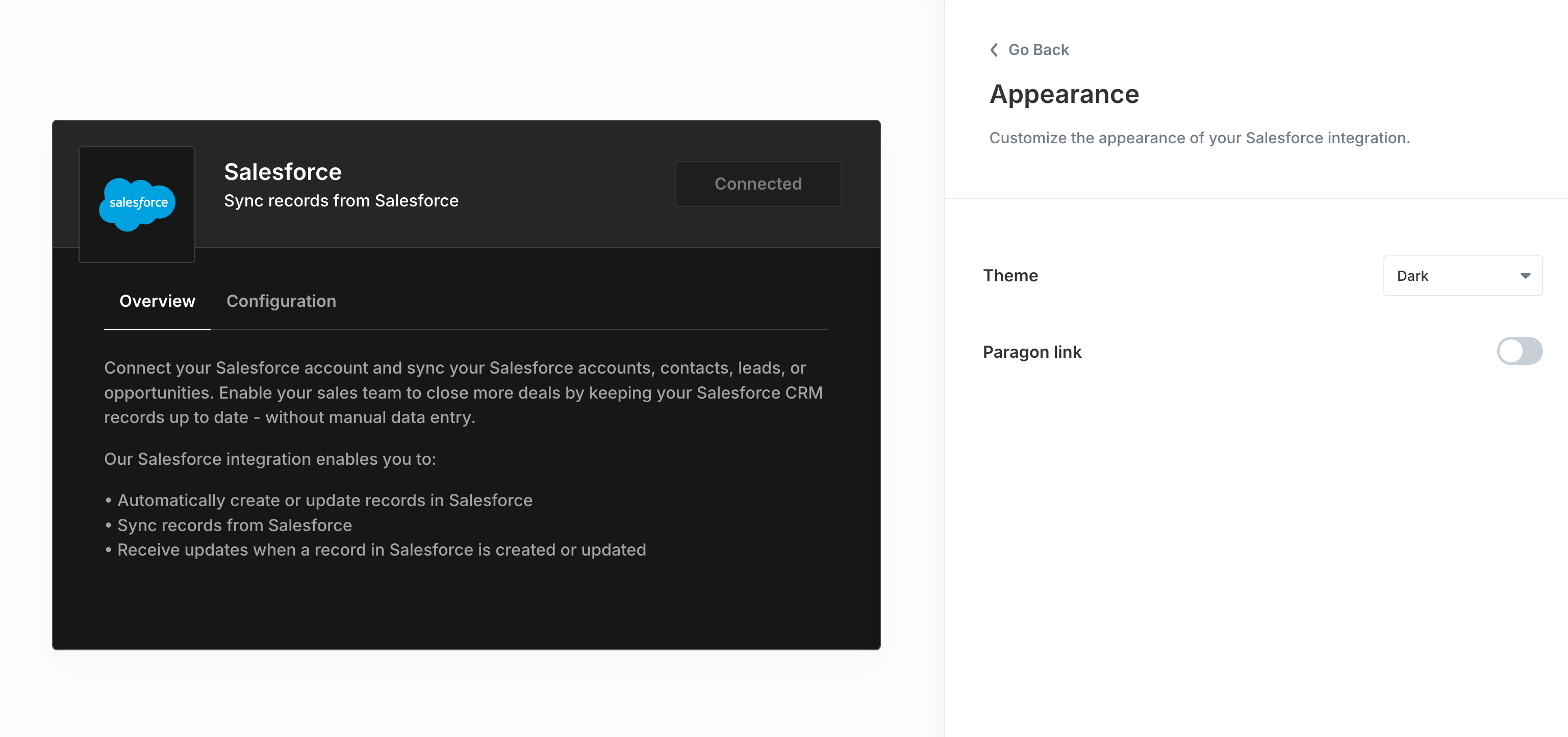
The Connect Portal supports both light and dark themes, allowing you to choose a theme that matches your application's overall theme. The Connect Portal can also detect and match your user's system theme settings by selecting "Match System Theme" from the theme dropdown.
#### Light
}>
Learn more about adding and configuring User Settings to let your users customize their integration and workflows.
### Workflows
Under the **Workflows** section of the Configuration tab, you can control the visibility and customize the description of workflows that appear in the Connect Portal.
}>
Learn more about controlling which workflows appear in the Connect Portal and how they are displayed to your users.
## Appearance
### Theme
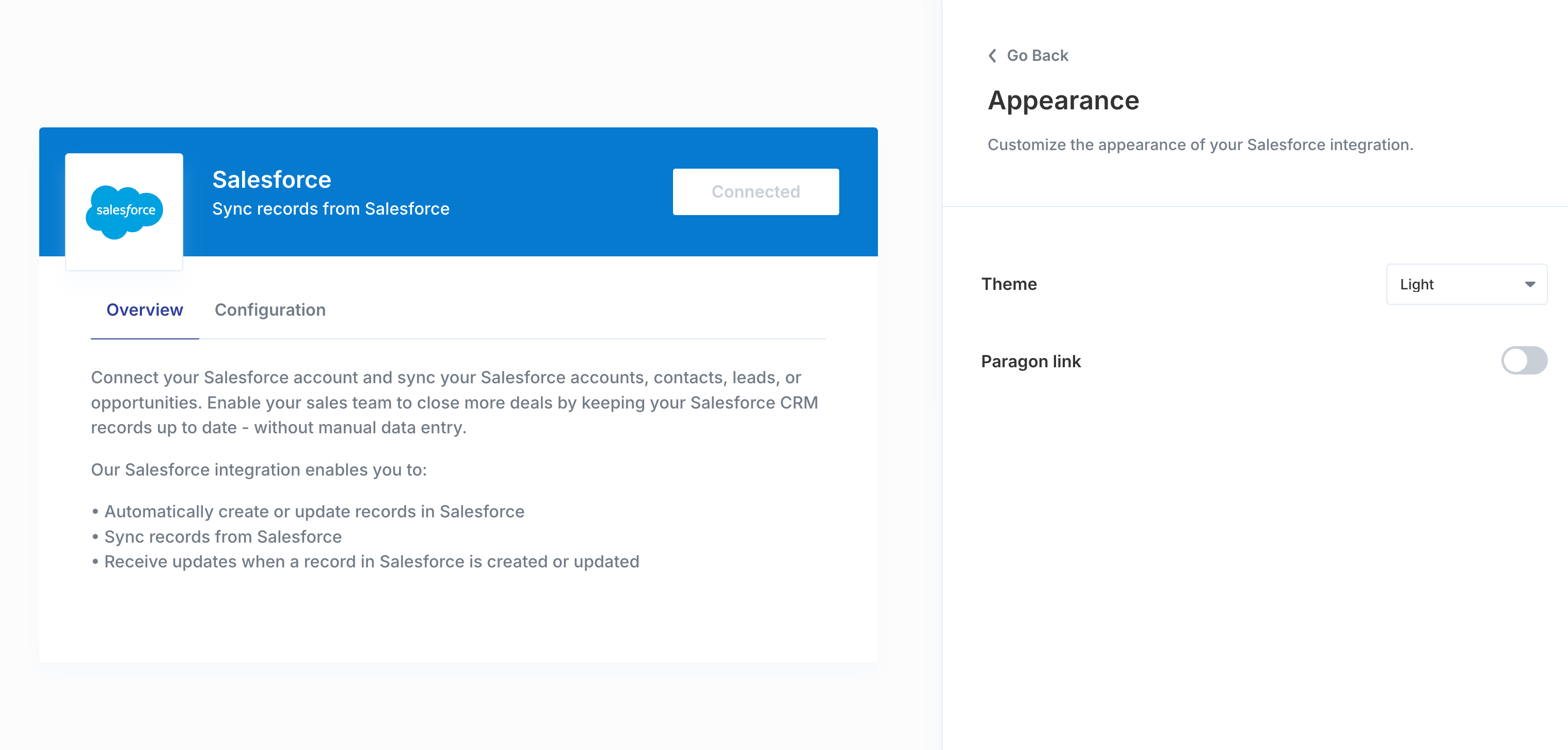
The Connect Portal supports both light and dark themes, allowing you to choose a theme that matches your application's overall theme. The Connect Portal can also detect and match your user's system theme settings by selecting "Match System Theme" from the theme dropdown.
#### Light
 #### Dark
 ### Paragon Branding
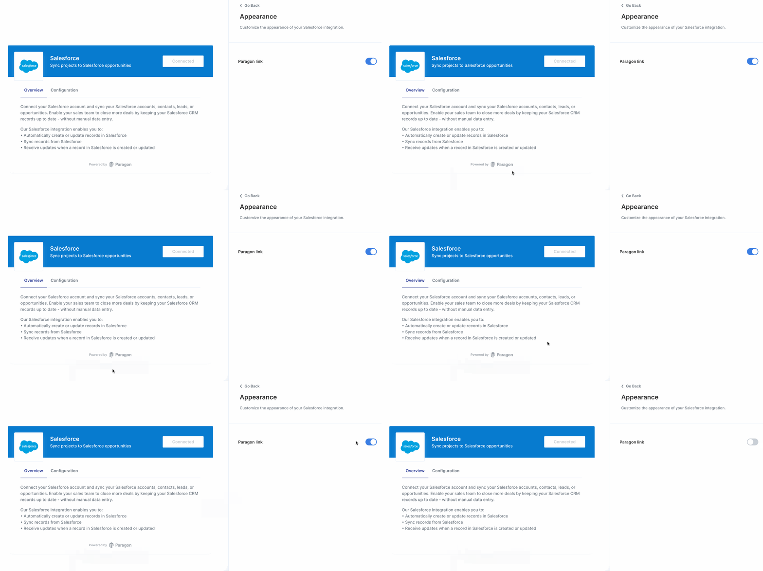
You can optionally turn off the Paragon-branded footer in your Connect Portal.
Whitelabeling the Connect Portal, which allows you to remove Paragon branding, is available on our **Pro plan** and above. Please [contact us](mailto:sales@useparagon.com) to enable this option on your account.
### Paragon Branding
You can optionally turn off the Paragon-branded footer in your Connect Portal.
Whitelabeling the Connect Portal, which allows you to remove Paragon branding, is available on our **Pro plan** and above. Please [contact us](mailto:sales@useparagon.com) to enable this option on your account.